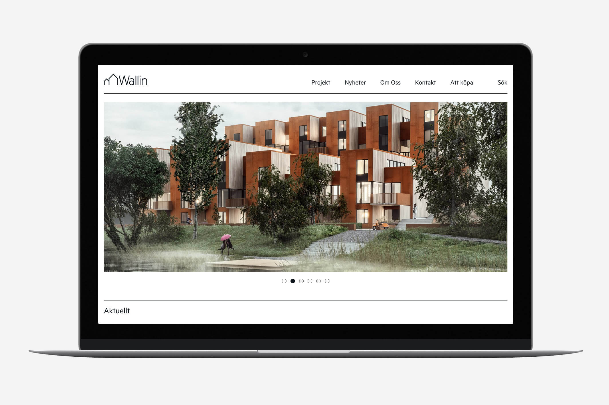
Solution
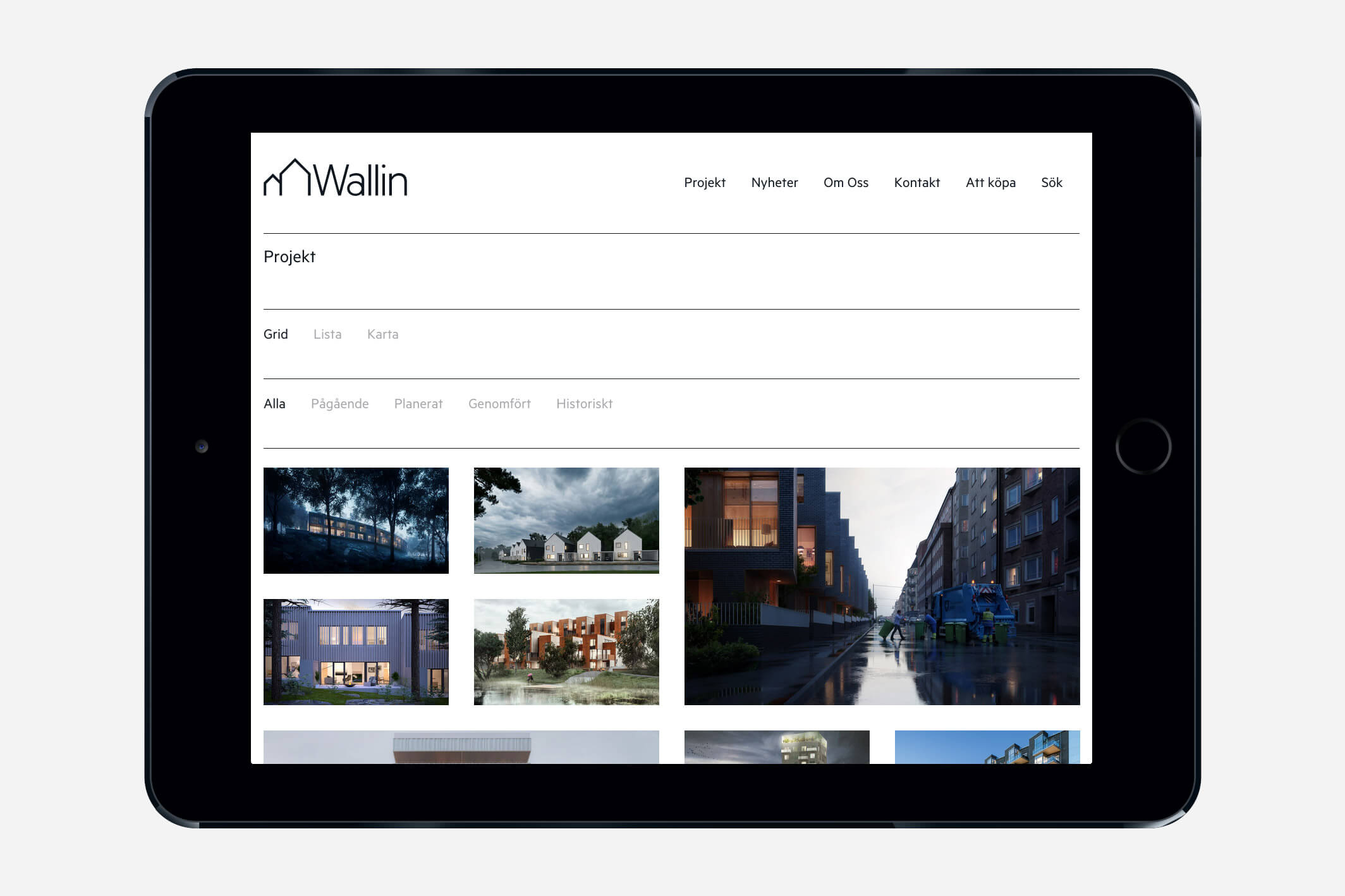
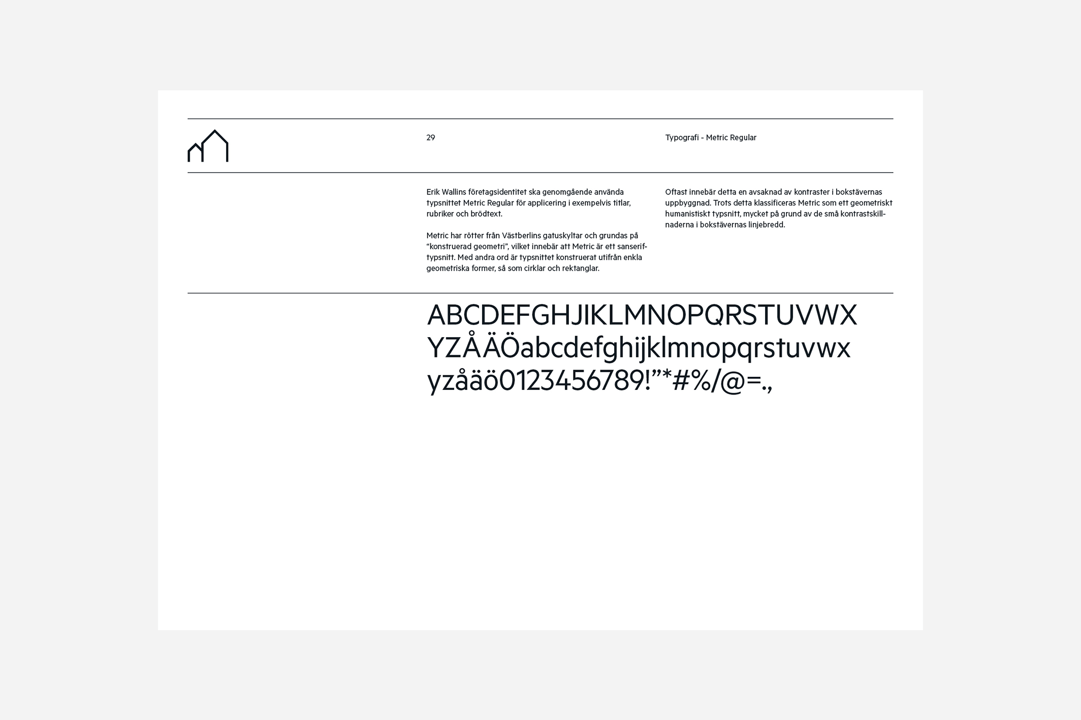
In the new identity, we wanted to enhance the company’s personality of sustainable design, quality and dedication. The typeface used is called Metric and has its roots in West Berlin road signs. It’s also based on “constructed geometry”, a fact we found very suitable for the building firm Erik Wallin.
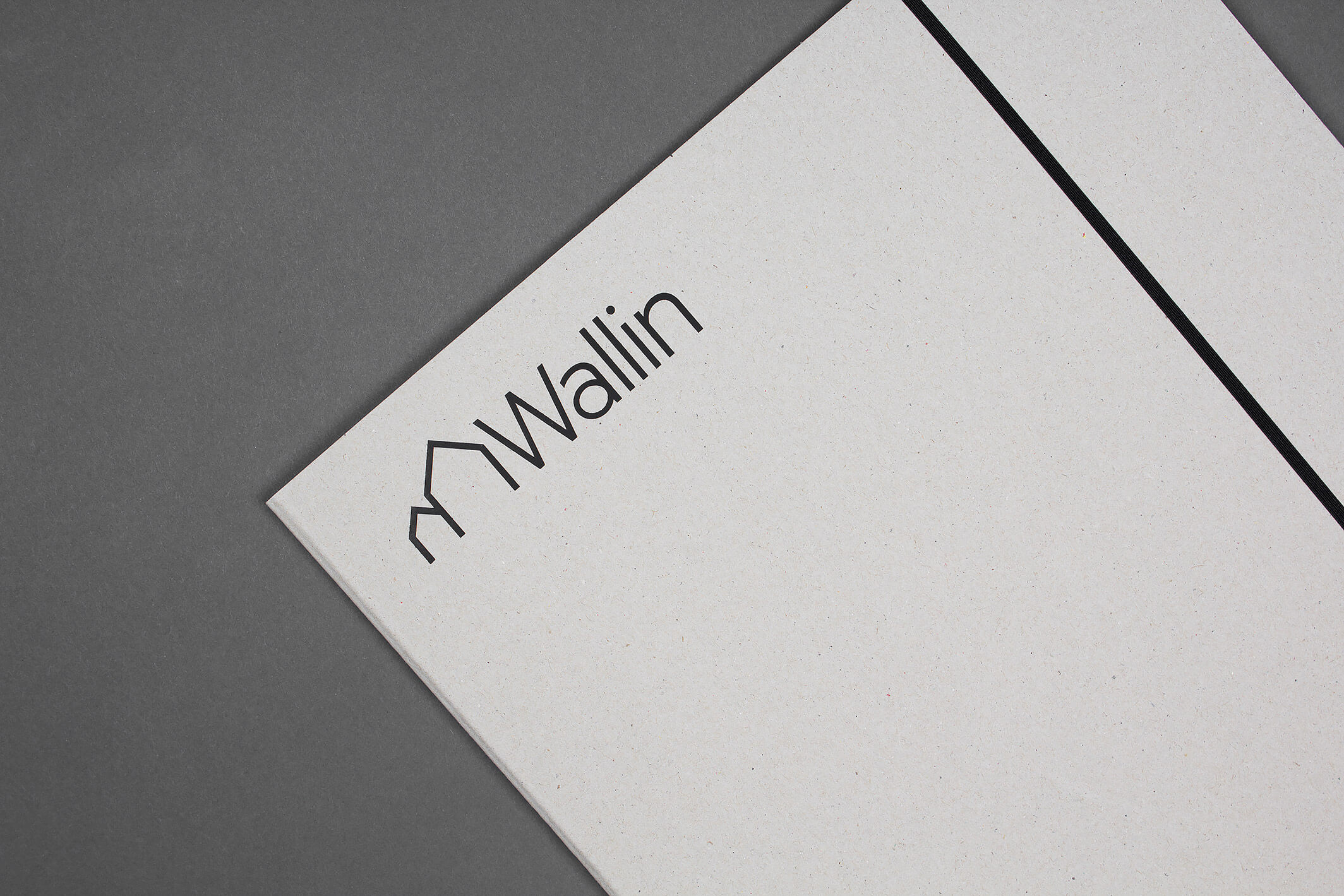
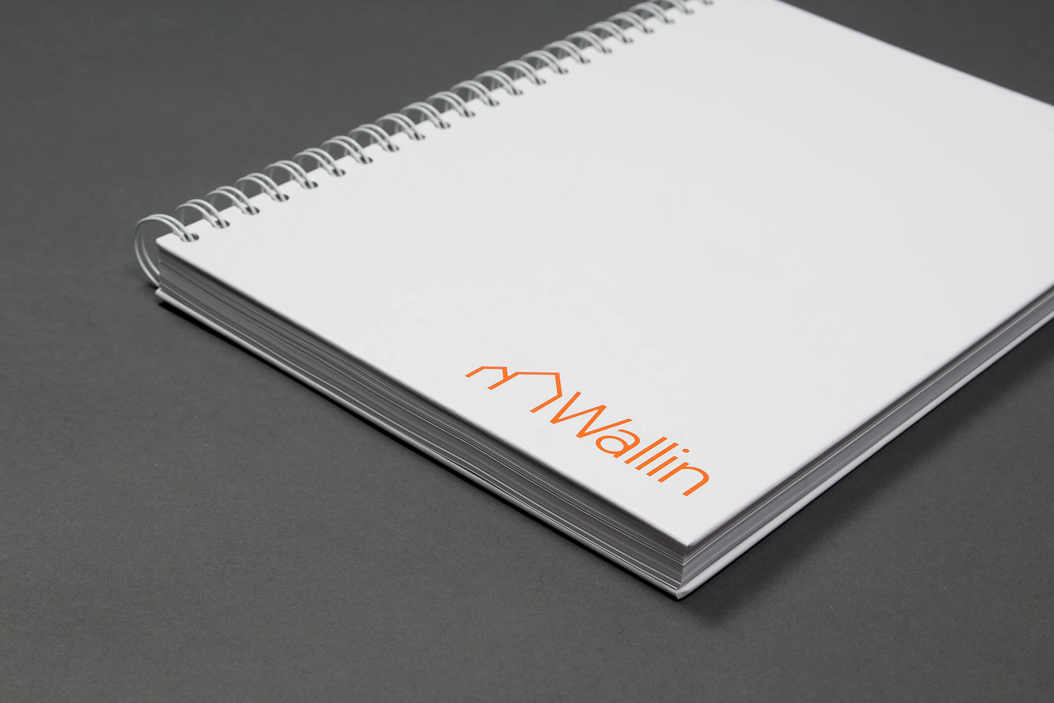
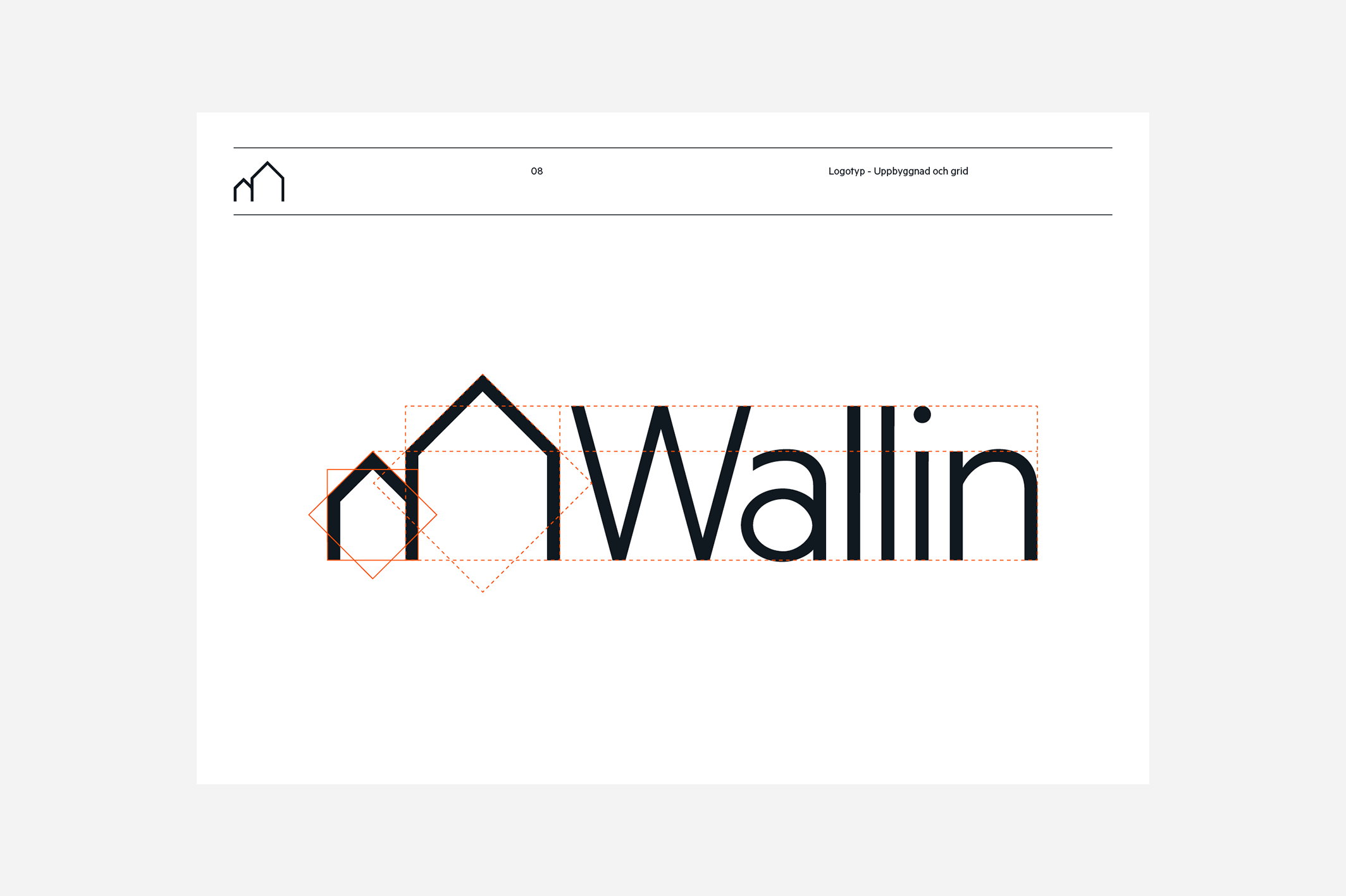
The logotype got to keep its two familiar houses. But they were made flat to make the logo more user friendly. We gave it a classic touch by using the font Metric as our base. But when tweaking some characteristics – such as the interior of the lower case a – the logotype got its own, unique, vibe.
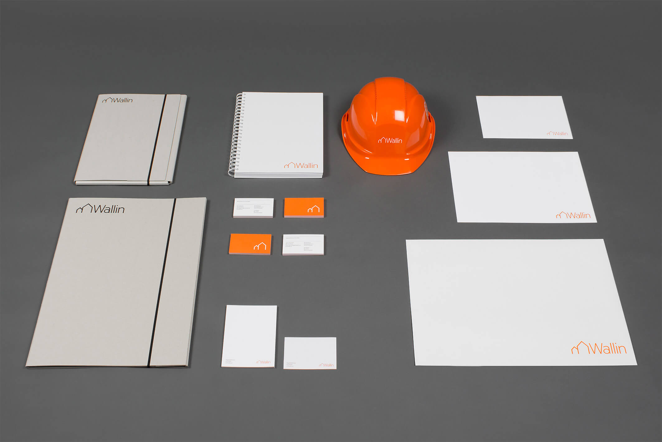
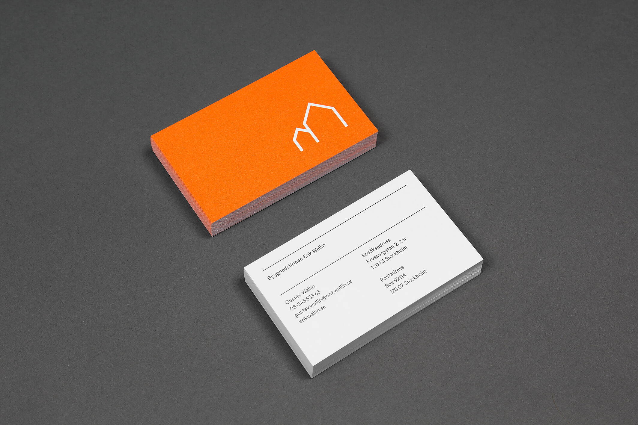
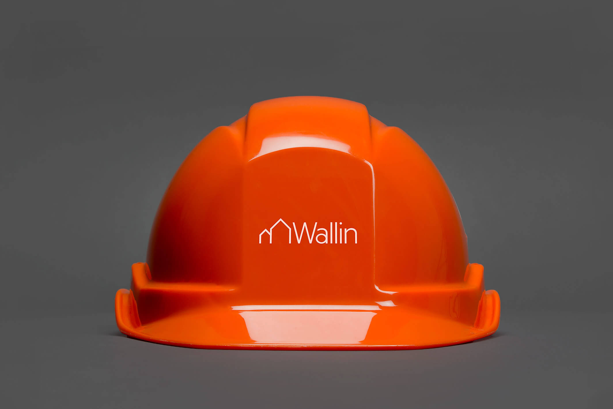
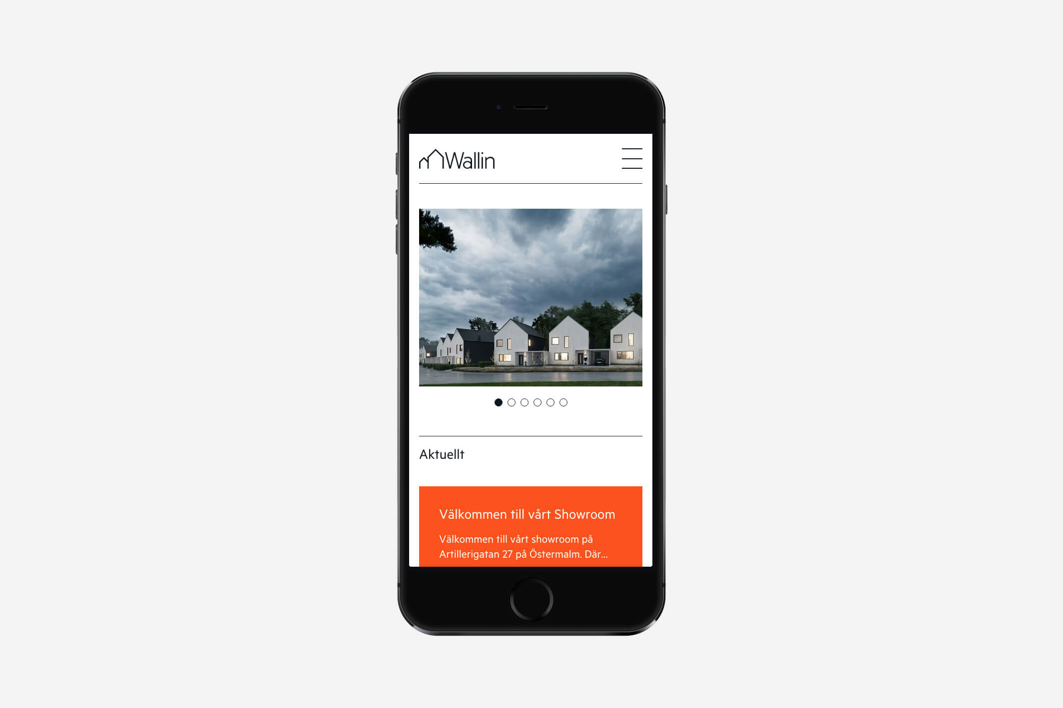
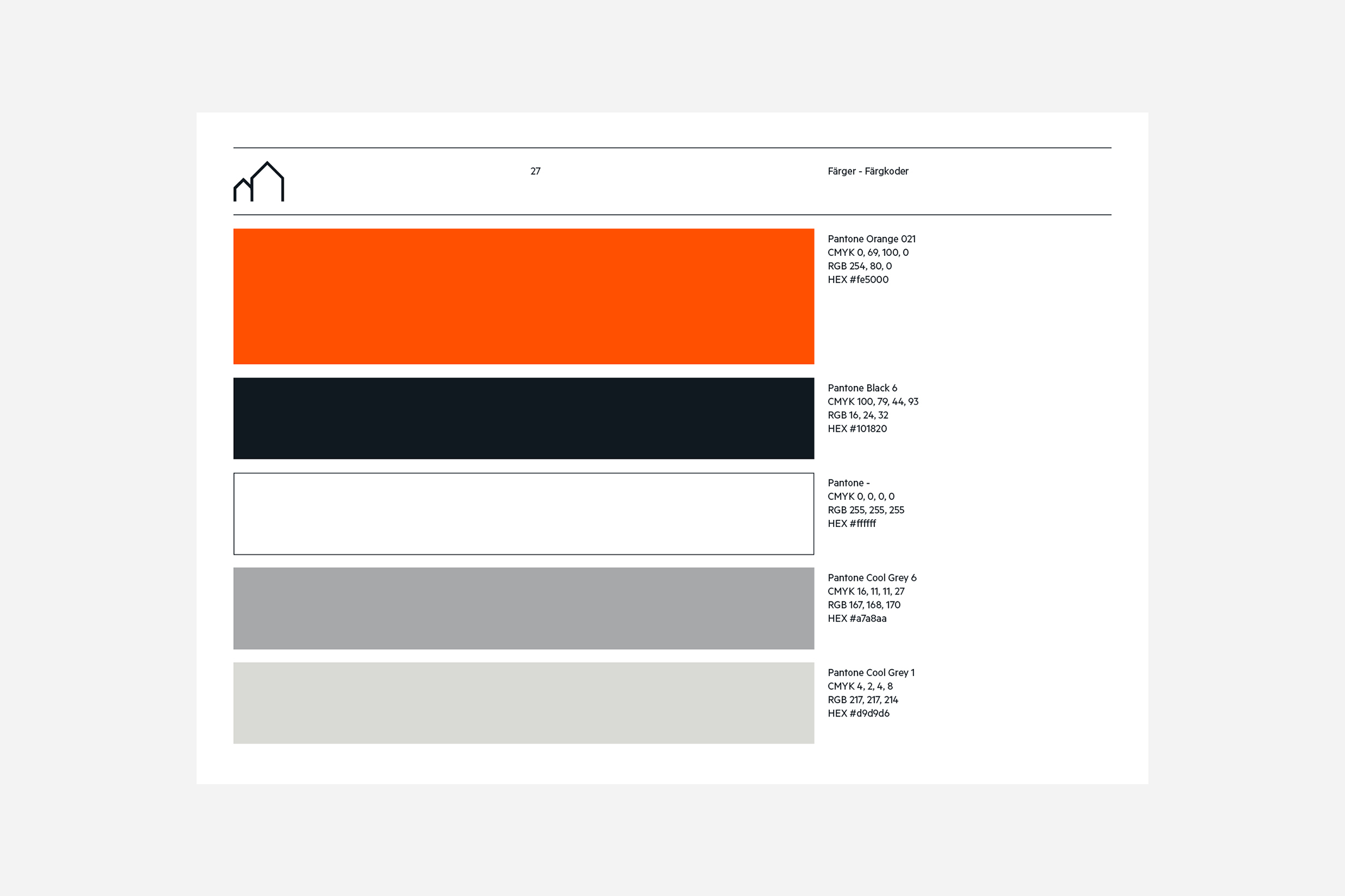
We picked a color scheme from a typical environment: their construction sites. Helmets and scaffolding inspired a fresh orange, rocks and steel a classic grey.